I love when posters for movies and TV shows have a story to tell and this one does. I’m not a professional but I’ll share my impression of this little gem.
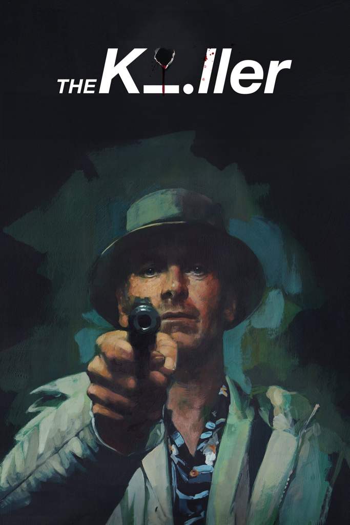
I like this poster for many reasons, but the eyes are number one. There’s a gun pointing at me, the viewer, yet I’m drawn to the eyes first and the muzzle of the gun second. I guess in real life it’d be the other way around – it’s been proven. The eyes look sad, determined, or emotionless at times. The hat’s shadow almost obscuring the eyebrows suggests the lack of emotions since they are often used to convey emotion, so barely seeing them suggests the character almost doesn’t have them.
The gaze and the gun give even more meaning to the tagline “Execution is Everything.” The gun is dangerous and aimed at the viewer as if we’re next. It also represents the profession named above, Killers can have guns. I love the bullet hole, blood spatter, and letter “i” laid down on its side in the title design. The bullet hole both takes the place of the letter “i” since the word “Killer” is still legible, even when ignoring the dropped “i,” since we’re used to seeing a bullet hole as the dot in the “i.” The “i” is obviously the simplest representation of someone, and the blood splatter indicates the murder.
The painting style of the poster might be because of the graphic novel roots but it’s not the first of Fincher’s work to have a poster in that style. The fascinating thing about it is the darkness surrounding Fassbender’s character, it’s either about to engulf him or disperse, but if you know the graphic novel you’d think one more than the other.
If you want to support this site, help by getting me a coffee from the link below:

One thought on “The Killer | Poster Analysis”