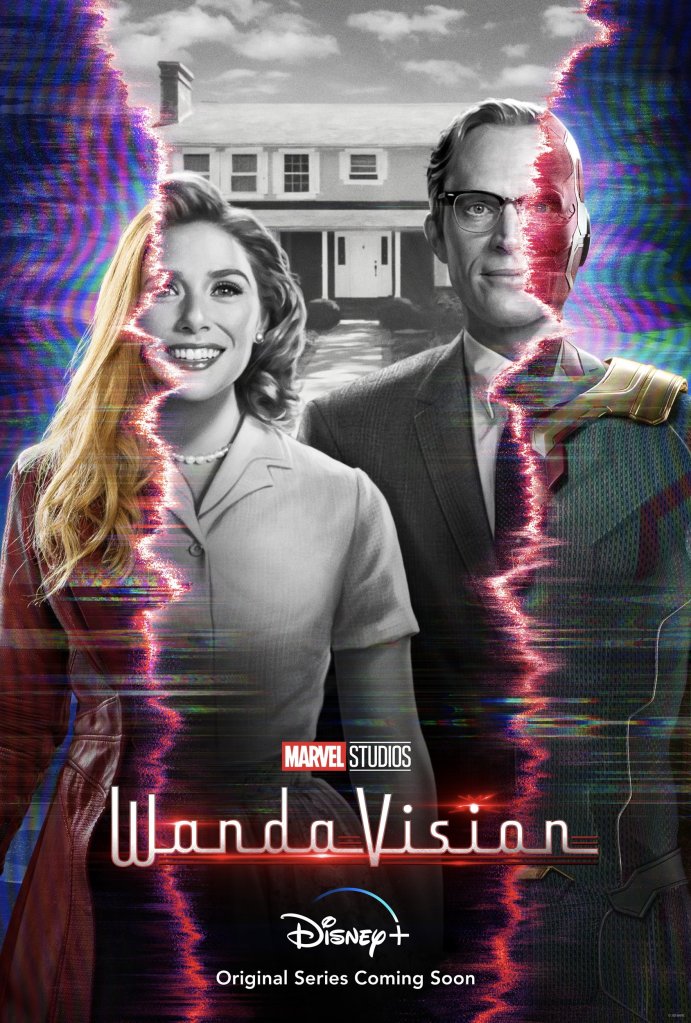
I love this! This WandaVision poster is brilliant. Given what we know of the series, meaning that it’s inspired by different sitcoms throughout the ages, the static wave like ripples on the image screams TV. In fact the whole thing looks like a picture of a temperamental television screen.
The demarcation between the black and white, and color seems like the result of a TV that’s not receiving the signal properly. But most notable is the red color of that demarcation, it is how Wanda’s powers manifest in every movie she’s appeared in. They’ve mixed Wanda’s powers with the static of television. We know she’s the one doing this, creating different realities. The jagged edges the demarcations in the image make it look like a portal, a tear, a rip in reality? It tracks with the reality warping powers we know Wanda to have in the comics.
The black and white part of the image is the dream, the warped reality, and the color is reality. Since what happened to the couple in Infinity War it weirdly makes sense that they’d end up in the….1950s? Where everything is perfect, not a hair out of place. I don’t know about you, but I find that the 1950s esthetic can easily look creepy. For instance, the whole image has a trippy look to it, particularly the parts of it in colors at the edges of the poster where it’s wavy and we see Wanda and Vision as we’ve seen them in the MCU.
WandaVision is gearing up to be a weird, trippy but sophisticated show and I’m here for. Even the posebthey’re in is reminiscent of a familiar image, the 1930 painting by Grant Wood, American Gothic.

2 thoughts on “Wandavision | Poster Analysis”